Showing posts with label typography. Show all posts

3.29.2009

food :: helvetica milk

An interesting way to pour milk...


"Milk" from visualadvice in collaboration with Gabriel Lefebvre.

"This project is an experiment in cardboard packaging as well as in communication.
It represents the content of the product in the simplest way, both through word and image.The packaging is the same dimension as a 2 liter carton of milk."

3.01.2009

design :: flickr abc's

Spelling with pictures is fun. And JUST COOL if you use this fun flickr application I found over at metaatem.


Hmmm..... I wonder what other cool apps that smarty pants, Eric Kastner has up his sleeve...

1.02.2009

design :: amazing ambigrams


I'm sure that you've heard the word ambigram before. From wikipedia : An ambigram, also sometimes known as an inversion is a graphical figure that spells out one or more words not only in its form as presented, but also in another direction or orientation. The text spelled out in the other direction or orientation is often the same, but can also be a different text.

Take a looky at these amazingly designed ambigram logos.


I love this one...and the movie too ;)


You can even play around and make your own ambigram over at flipscript. I tried it - It's JUST COOL!
via logodesignlove & ambiblog

12.27.2008

food :: it makes me cry

I don't care what anyone says - this always makes me cry...


unless wearing goggles. JUST COOL Typography!

12.11.2008

art :: Funky fonty Landscapes


[Wayne+White4.jpg]
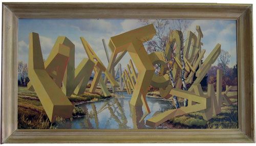
Wayne White takes old thrift store paintings and jazzes them up with his own embellishments - namely words. I guess that saying that "a picture paints a thousand words" is true when it comes to his cool paintings. The former Pee Wee's playhouse set designer turns his second hand finds into beautiful funky landscapes that are definitely a little kitschy, a little funny and ALOT strange.


Cover for Issue 260


What made him turn from a life of producing successful music videos and decorating Pee Wee's playhouse? "I wanted something that was 180 degrees different from Pee-wee. So I decided to start painting traditional romantic American landscapes. I'd do historical scenes, giant Civil War battles, or a steamboat coming down a river. I taught myself traditional oil-painting techniques. The paintings started getting just a little weirder and a little weirder. I started putting monsters and stuff into them, but I kept the same realistic technique. And then one day I wanted to put a giant phrase in. I had one of those thrift-store landscape reproductions in the studio. I was going to take the picture out and just use the frame. But right before I did that, I looked at it and thought, Well, what would happen if I just used this ready-made landscape? It was kind of just an experiment."

His paintings are a funky concept I like! They're JUST COOL!


12.08.2008

art :: write me a letter

I guess Mrs Eaves really does love type. 8 hours of writing,5 permanent markers, 3 baths and 2 showers to clean off = part of a campaign to promote writing on designated graffiti spaces rather than someone elses property. Would you write all over your property?


via fortheloveoftype

 
ss_blog_claim=5f161539492888cd4f85ea9e137c404c